Creating the NHS website roadmap — a case study
We just published a new roadmap for the NHS website. This is the result of several months’ work to decide what we will (and won’t) do to meet user needs and organisational goals on the UK’s biggest health website.
We made significant changes to how we created and presented the roadmap compared to previous years. This blog post describes what we did and how we did it, and includes templates you can adapt and use for creating your own roadmaps. This blog post is not about the theory of roadmaps but I have added some links to articles I found helpful at the end.
Context
To date, the nhs.uk roadmap that we’ve used internally has been more like a Gantt chart than a true roadmap — a high-level delivery plan. Each item on the ‘roadmap’ had a start and an end date and a description of the output, not the outcome.
The roadmaps for nhs.uk and NHS App had previously been created separately. This time around we used the same process which helped us to collaborate better on shared goals.
20 product managers contributed to the nhs.uk and NHS App roadmaps, as well as other team members and stakeholders. The process we used might look a little weighty but it was necessary to coordinate that many people.
Finally, we used the tools available to us, such as Mural and PowerPoint. There are no doubt better tools out there but that’s what we had. We made no effort to integrate the roadmap with the software we use to plan and track teams’ work because our teams use a mix of Jira, Azure DevOps and Trello.
Overall objectives
The NHS website is perhaps best described as a collection of products on a single URL rather than a single product. Each group of products has its own objectives but we also have top-level objectives for the site as a whole. These are:
- Run and maintain our existing live service
- Improve our existing live service
- Make our live service more efficient
- Support initiatives where nhs.uk is a key channel
Deciding roadmap items
We started by creating a summary document for each item that might make it onto the roadmap — a ‘roadmap item canvas’. The aim of this was to have a consistent format so that we could easily compare different items when prioritising them and deciding what to focus on next.
These canvases summarise:
- the problem that needs solving
- the users affected by this problem and their needs
- our hypothesis about solving the problem (“if we do X this will help users do Y”)
- the outcome we are hoping to achieve, including benefits and KPIs
- alignment with other priorities or strategies, such as A plan for digital health and care or the NHS long-term plan
- dependencies
- size estimate (small, medium, large, extra-large)
- value score.
The value score is an attempt to put a number on how valuable we think each item is to make it easier to compare with other items. The value score takes into account the extent to which solving this problem would improve health outcomes, improve people’s experience and reduce costs, as well as the number of people who would benefit from it.


Download a copy of the roadmap item canvas (pptx)
Deciding the format of the roadmap
Now we had a longlist of roadmap items we needed a space where we could play around with the sequence of them and discuss the options and choices we needed to make.
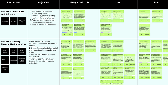
On a digital whiteboard we set up a draft roadmap using the popular Now/Next/Later format. This format reflects how we actually work — it acknowledges that plans can change. For example, the ‘next’ column is what we currently think we are going to do next but this could change based on findings that come out of work being done ‘now’ or a shift in priorities.
The flexibility in this format is also particularly useful right now as our organisation is working through a complex set of mergers, a reduction in the number of permanent staff and changing senior decision-makers.

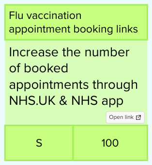
On the whiteboard, each roadmap item is represented by a card showing its name, a short description of the problem or intended outcome, its size and value score. There’s a link from each card to its roadmap item canvas if you want to explore further and see a more detailed layer of information.

The webpage version is yet another layer of information. It’s a high-level, text-based narrative. You can’t click through to more detail about any of the items — that’s something we’ll maybe add later.
Reviewing the roadmap
We used the whiteboard version of the roadmap to share our thinking and get feedback from others. We discussed it at a team level and we shared it with colleagues and stakeholders more widely.
One vital feedback loop was delivery planning — checking that the roadmap could actually be delivered by our teams, and either changing the roadmap or supporting the teams where it couldn’t. Focusing on the ‘Now’ and ‘Next’ parts, our delivery managers looked at dependencies and capacity and worked out how to mitigate any issues.
Publishing and updating the roadmap
Finally, we had a version that we felt was prioritising the highest value things and that was deliverable.
‘Working on now’ roughly covers the period April to June 2023. We will come back to the roadmap about halfway through that period to review the ‘Working on next’ parts and decide if that really is what we plan to do in July to September 2023 or if we need to make changes.
What went well
Producing a roadmap in this way was quite different to how we had done things before, but it din’t feel that big a leap because it was more in tune with our established ways of working.
In particular, the format proved very flexible. It was easy to move things from ‘Now’ to ‘Next’ (or vice versa) without feeling like you were breaking everything else.
Because there were so many people involved we needed to be quite organised. It was also helpful therefore to have documentation. I published guidance on how to create a roadmap item canvas, and what was needed by what deadline. I tested this with people and I iterated it based on their feedback. This guidance included basic stuff like:
- how to decide if your item’s size is small, medium, large or extra-large
- how to calculate value score
- links to key NHS strategies and plans.
Most encouragingly, there was no pushback on this new way of producing a roadmap. Not that there should have been — it’s in line with the ‘product mindset’ that the new NHS England wants to adopt — but any change can be tricky. Our programme management colleagues are redesigning some of their tracking and reporting processes to fit in with this new way of working.
What didn’t go so well
We didn’t involve one particular group of people soon enough. This was a problem because they have a big say in how things get done and who is best placed to work on a particular thing. They are also a knowledgeable, experienced group and their feedback on an earlier draft of the roadmap would have been welcomed.
We also struggled to define KPIs for some of the roadmap items. This is because we are unable to track some of the outcomes we are hoping to achieve (eg increasing take-up of non-prescription pharmacy services) so we have to rely on proxy metrics (eg views of specific information) which can feel a bit distant from the intended goals. More work is needed in this area.
